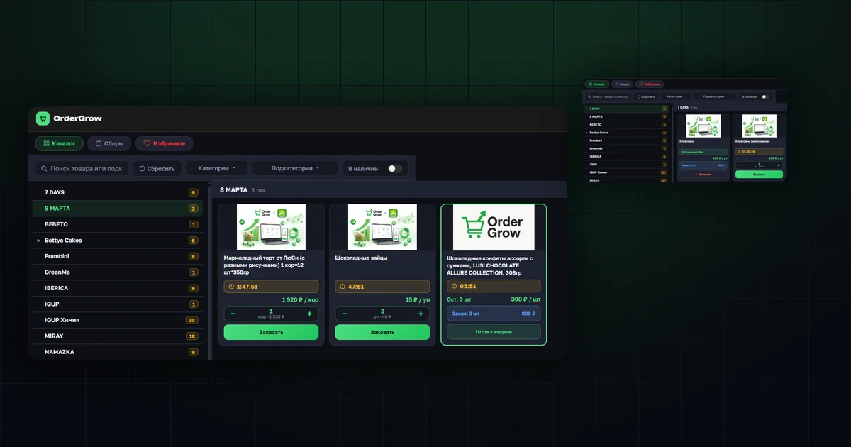
What changed
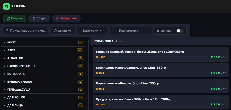
Before, to order a product you had to open its card first — the photo, stock, and order button were only available there. You couldn't order directly from the catalog or from Hits.
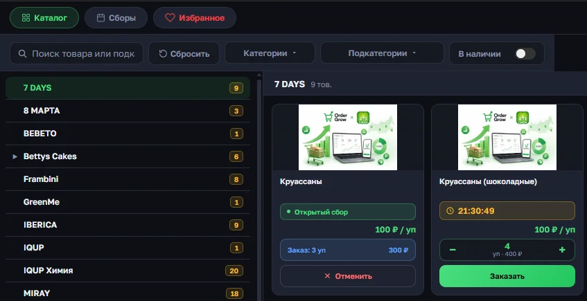
Now the order button and a quantity counter are on every item — when browsing any category or subcategory of the catalog, and in the Hits section too. That's what makes quick ordering possible — no need to open the product card just to place an order.
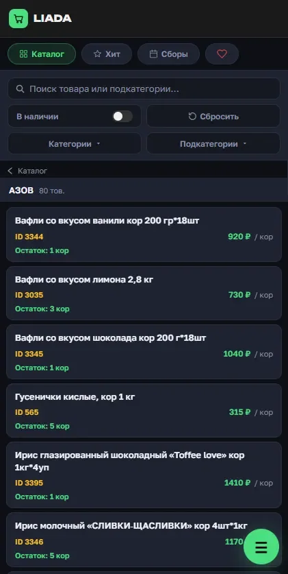
In the catalog. A subcategory's product list used to show only a name, an ID, and a price. Now every item has a photo, the round's status, and an order button.
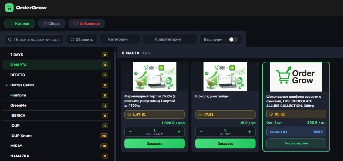
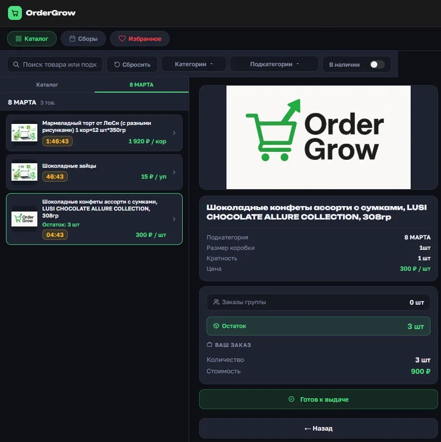
With a product card open. The narrow list next to the card used to be text-only too. Now every item has a photo and a status, and the card on the right immediately shows the current order status — all the way to "Ready for pickup".
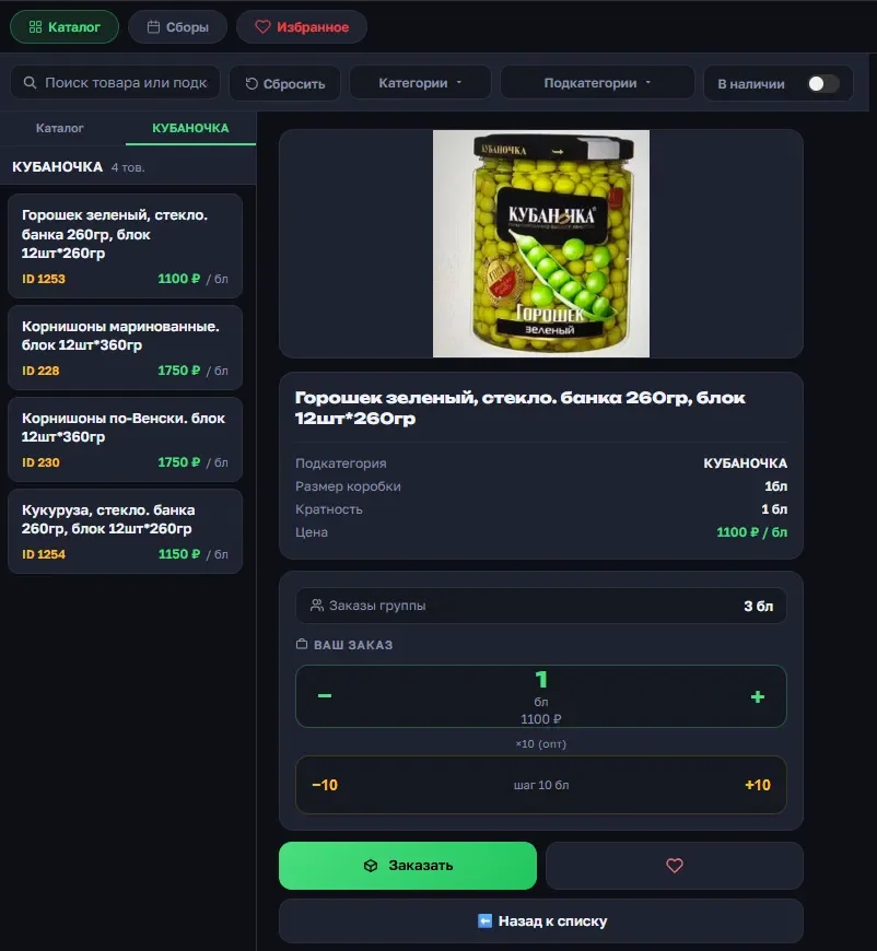
On mobile. The same change — a text-only list became a grid of cards with photos, a counter, and an order button.
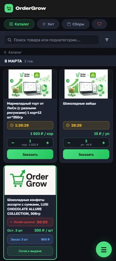
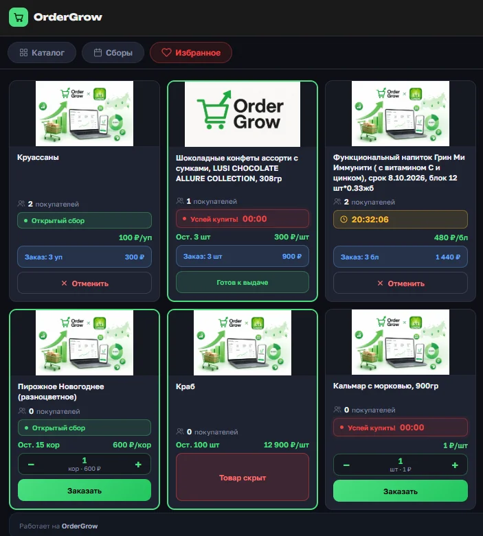
Once placed, the order status is visible right there too — "Open round", "Ordered", "Being purchased", "Ready for pickup" — along with a cancel button.
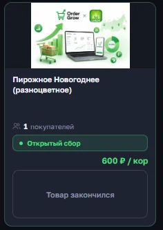
If a product is out of stock and the organizer hasn't allowed orders beyond stock, the card shows "Out of stock" instead of the order button.
Filters on mobile no longer take up the screen
On mobile, the filter panel now collapses into a search bar with a single button — tap it to expand. If a filter is already selected inside the collapsed panel, a green dot lights up on the button, so you can tell a filter is active even while the panel is hidden.

In "Collections" and "Favorites" too
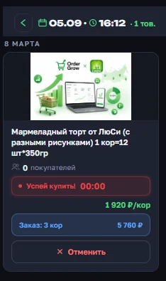
After opening a specific collection round, products are now shown as cards too — with a photo and an order button right there, no need to open the product card. If something is already ordered, it's visible right away: quantity, total, and a "Cancel" button, on the same card.
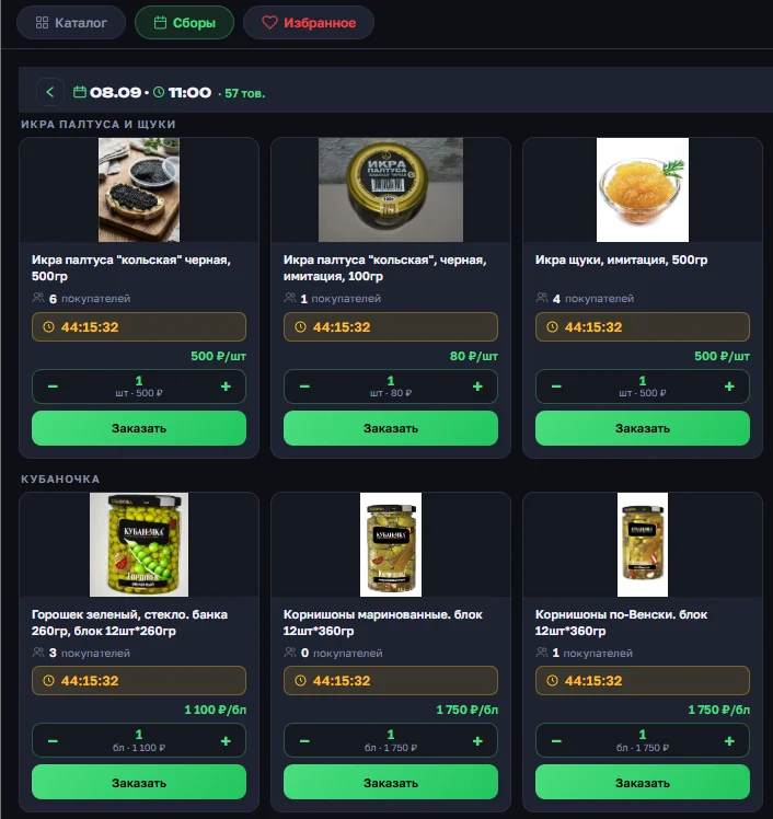
The collection list itself got a refresh too: the block with the date, time, and item count is now more compact — it fits on one line, and the button to go back to the full list of rounds is now easier to spot.
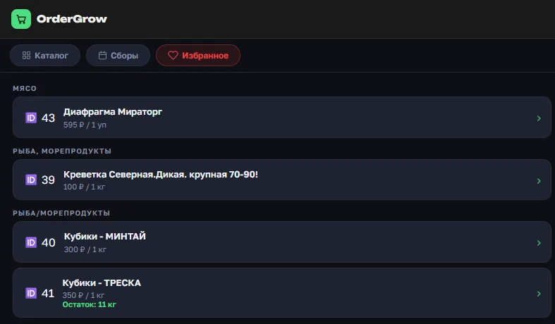
Same story in "Favorites". The list of favorited products used to show only a name, an ID, and a price. Now it's the same cards as in the catalog: a photo, a status, and ordering right there.
Why this was done
OrderGrow originally worked only through Telegram. As the number of app users grew and the online platform developed, and following requests from group-buying organizers, a full web app appeared, combining a website and an app for orders. Looking at how ordering works on major online marketplaces, and at customers' requests, the catalog was updated the same way: fewer clicks between seeing a product and placing an order.
Where to read more
How the overstock-ordering permission works, now visible right in the catalog, is covered in "Order beyond stock". You can browse the catalog without logging in through the public storefront. And how you get notified when a favorited item is back in stock is covered in "Favorites notification".