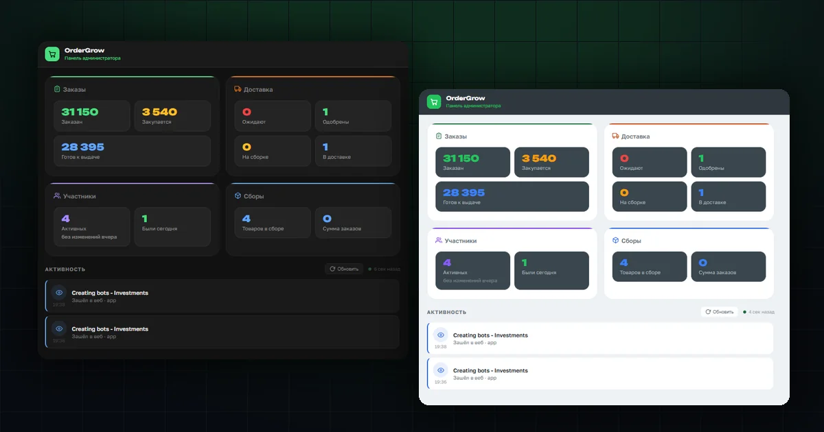
OrderGrow has been dark from the start. That works well in the evening and on a phone, but not for everyone and not always: in bright light a dark screen glares, and a habit of light interfaces is a stubborn thing.
Now there are two themes. They switch with one toggle and apply across the whole interface — both the customer app and the admin panel.
How to switch
The "Profile" section has a new "Light theme" toggle. One tap and the interface changes immediately — no page reload, no trip into settings.
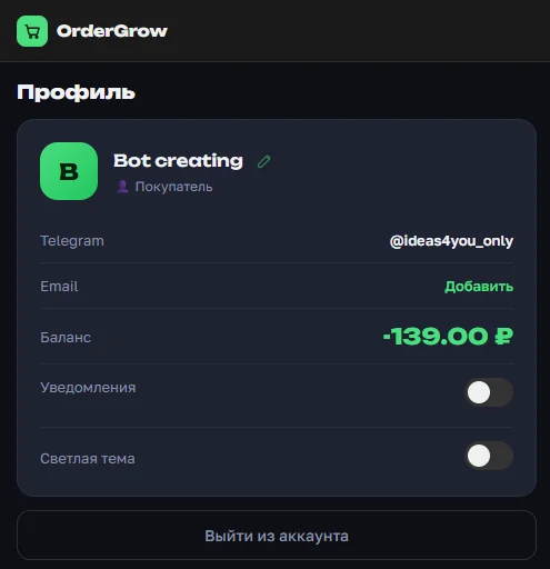
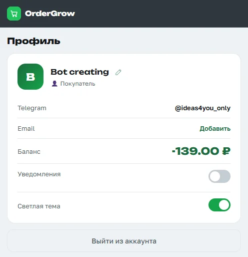
The toggle is available to customers and organizers alike, so everyone sets it up for themselves. Your choice is remembered: next time you sign in, the interface opens in the theme you left it on.
How it looks for a customer
The catalog, the product card, stock levels, round statuses — everything is recoloured, not just parts of it. Product photos read differently on a light background: the white backdrop doesn't pull attention away, and the shot looks closer to how the item will appear on a shelf.
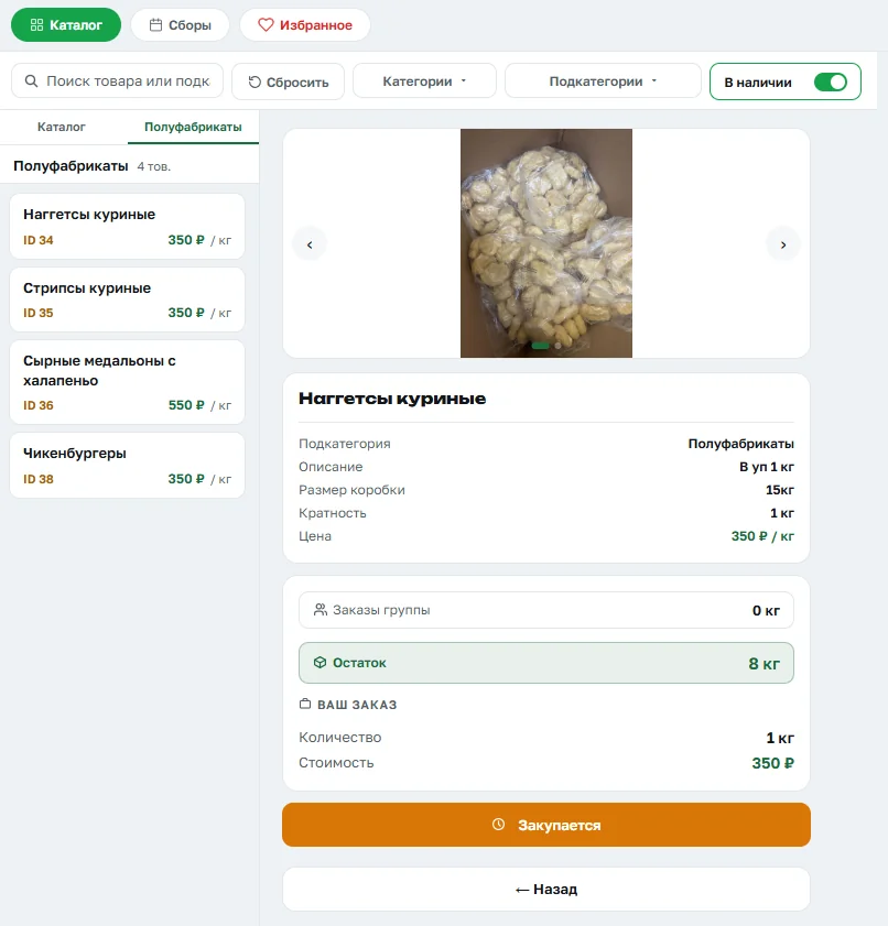
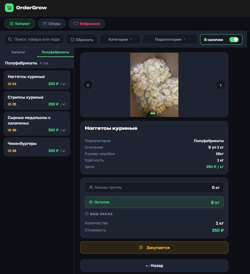
The meaning of the colours is preserved in both themes. Green still means available, orange means the round is being purchased, red means a problem. The shades changed, not the meanings: someone used to one theme doesn't have to relearn anything when moving to the other.
The admin panel
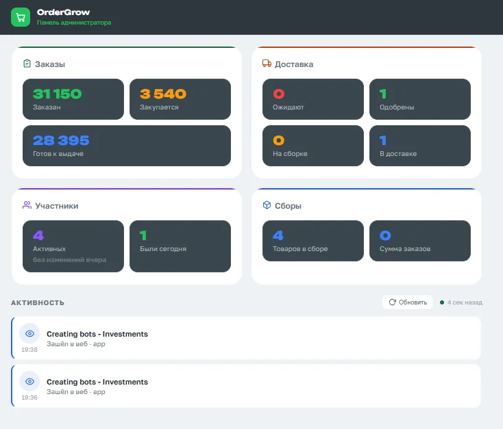
The summary, activity feeds, tables — this is where the light theme gives you the most. An organizer's work is mostly work with dense tables, and long rows of figures are easier to read on a light background.
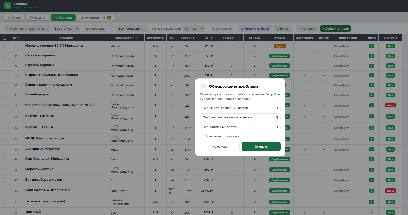
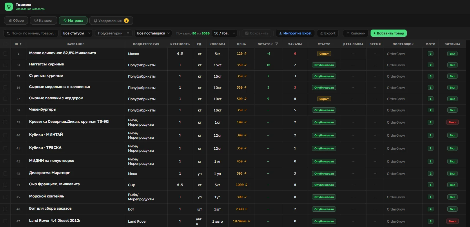
The three main tables — the matrix, orders and participants — were also brought to a single look: a white working surface, a dark header with column dividers, the same hover highlight and a selection bar on the left. Each of them used to look its own way.
What else changed along the way
The header and menu stayed dark in both themes. That isn't an oversight but an anchor: navigation doesn't change appearance when you switch, so your eye keeps its familiar landmarks at the top of the screen.
Buttons got a clear hierarchy: a green fill is the main action, red is deletion, orange is an irreversible step such as launching a purchase, and outlined is secondary. A button's appearance didn't always tell you the consequences of pressing it, and on a light background that became noticeable.
One small thing that saves time: in the light theme buttons gained a bottom edge that disappears when pressed, so the button seems to sink. On a dark background a shadow did the same job, but on white shadows are barely visible.
Which one to pick
There's no right answer, and that's the point. Dark feels more familiar in the evening, tires you less in low light and saves battery on phones with OLED screens. Light wins in bright conditions — outdoors, by a window, at a handover point under lamps — and suits you better when screenshots become instructions for customers.
You can switch as often as you like and whenever you like: the toggle in your profile, one tap. Nothing is reset and no data is touched — only the appearance changes.